Click To Return To Blog Page
Logos, Daunting or Fun?
When going through the process of your individual Creative Brief, one of the most exciting parts is creating brand elements that represent who you are. No longer are you bound by the Montserrat black font, and Western blues and greens, you finally get creative freedom. However, when I was a content creator I struggled with designing a logo at first, so in this blog I'll give some tips on how I broke down the process and made a logo that's meaningful to me.
Utilizing Canva & Drafting
The first step you want to do in making a logo, is finding a place to make a logo. Canva is a really good tool for creating logos, as they include a lot of templates and elements you can use. The next step from here on it, is to just throw random ideas onto the page. Your first attempt at a logo isn't going to be perfect, so doodling random ideas is great in helping you in the ideation process. For me specifically I wanted my logo to reflect my initials (H+A) so I played around with the positioning until the I came up with the logo you see above you. This is all trial in error, so never feel discouraged if you don't like your first draft (it's a draft for a reason :D).
Incorporating Your Colors
After creating a draft, you can start to make your logo more dynamic. What I mean by more dynamic, is adding color! Following the creative strategy, at this point you should already have your brand colors in mind before making a logo. Play around with your logo and create different logo color combinations until you find one you like. For my logo, I had everything as a darker purple first, but then I decided to make the "A" a lighter shade to create more depth in my logo. I wanted my logo to have a "shadow" like appearance, and my use of colors definetly helped me visualize what I wanted. The more you play with colors, the more you can figure out what matches your liking.

Make Multiple Designs
Part of the logo design process, is having different versions of it. One being, the Logo Lockup. The Logo Lockup is a version of your logo with all your elements locked into place. An example being the logo, you see on the top of my home page. The structure of a logo lockup is, 1. The logo, 2. The Brand Name or initials, and 3. The Brand Tagline. This is a pretty common version of a logo, but what you can do to go above and beyond and create more brand differentiation is having different versions of your logo.
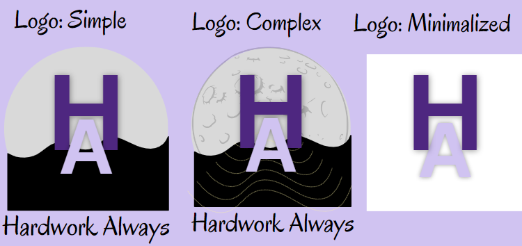
For example, take a look at the image of my logos above. I have a simple design, which I use in my website, to match a cleaner aesthetic for my website. This includes my initials in brand colors, but also a moon and shadow wave figure. These images are apart of my brand associations, and match the tone I want my website to be, radiant and calming. However right next to it, I also have a more complex version of my logo, more for creative use than for brand usage. I also have a minimalized logo with my initials alone.
Creating different versions of your logo is good, because it creates repetition as people are not seeing only one version of it. These logos can be also used for different things, one could be for your website, and a more simple version could be put on a business card.
Conclusion
Ultimately although it might seem daunting, creating a logo is such a fun process of your individual creative strategies! The more creative thought you put into, the more you'll enjoy the process of logo designs. As long as you remember to incorporate your colors, fonts, and brand elements, your logo can be virtually anything you want. Be confident in your abilities, and remember that rough drafting is always a good thing even in logo design. A logo is something that visually represents your brand, so you want it to be the best version you can!
